Mapping out IHOP vs. Waffle House
So I had never actually been to a Waffle House until they put the one in across from Stab and Grab in Clifton. I have to say though, I’m questioning my loyalty to Toppers as my post-rage food source. The second time I went there it was all still so new to me that I splurged a bit and ordered “the left side of the menu”. It was the best meal of my life…
Anyway, I was curious as to the geographic distribution of Waffle House and its only competitor I’m familiar with; IHOP. Below, is a county level choropleth colored by the IHOP/Waffle House ratio. Bright yellow represents 100% Waffle House while blue is 100% IHOP with the medium green translating to roughly 50%.
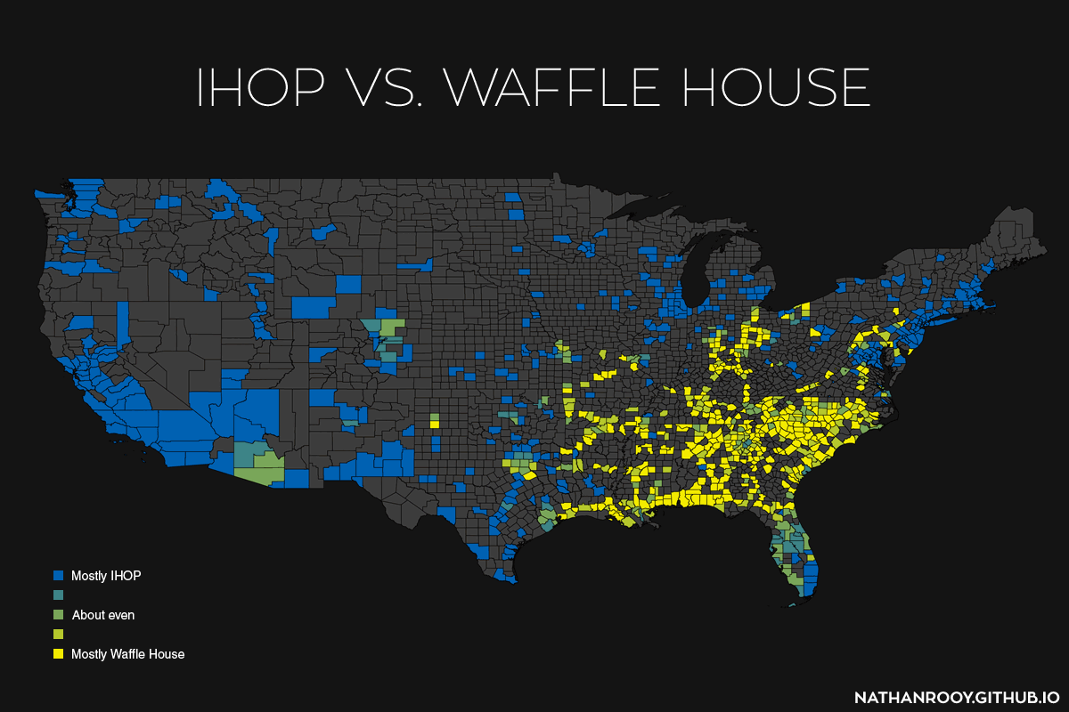
From the map, we can see that IHOP dominates on the west coast along with Americas power cities; New York, Chicago, and Boston. Waffle House is concentrated mostly in the south. Its interesting to see how the further south you travel in Florida, the more prevalent IHOP becomes until you reach Miami-Dade county which contains 15 IHOPs. I don’t know though, something about that swampy Miami heat and sugary pancakes just sounds wrong…
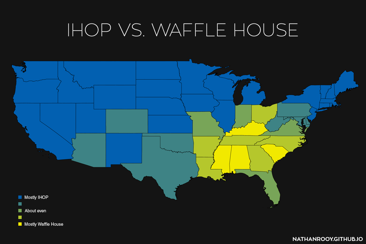
Because of the sparsity in the great plains regions I also created a state level choropleth seen below.
Hamilton County which includes Cincinnati is split at 50% with 6 IHOPs and 6 Waffle Houses where as Cuyahoga County which includes Cleveland is 100% IHOP with 3 locations. And since nobody cares about Columbus, I’ll just leave their IHOP/Waffle House ratio for you to guess…
Notes:
I scraped the IHOP/Waffle House locations off Google Maps and into an SQL database using a Python script I wrote. This netted 1659 Waffle House locations and 1648 IHOP locations. From there I imported the lat/lon positions into QGIS via a CSV layer and created the choropleth. I finished the maps in Photoshop.