Mapping out the Southern Cultural Divide in America
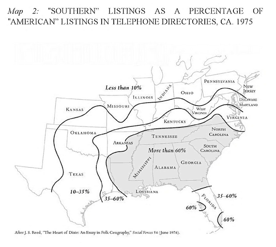
I just finished the book American Theocracy by Kevin Phillips (which is a seriously good book!) but in one of the chapters they included a map showing the regions of the United States which identify as “Southern” versus “American”. The map was originally created by J.S. Reed in 1975. They achieved this by looking through the yellow pages and counting the businesses that included “Southern” and “American”. From this data, they were able to create the contour map seen below (Google Books version here).
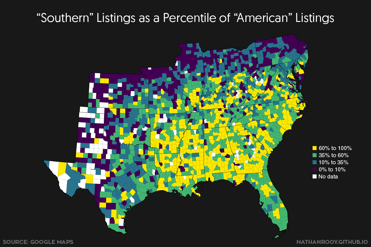
Anyway, I think the map is super interesting but a bit course considering we live in the age information. This prompted me to try and duplicate/validate the map at a higher level of detail using Google Maps. Below is the updated version of the map, using the same exact contour levels as the 1975 version.
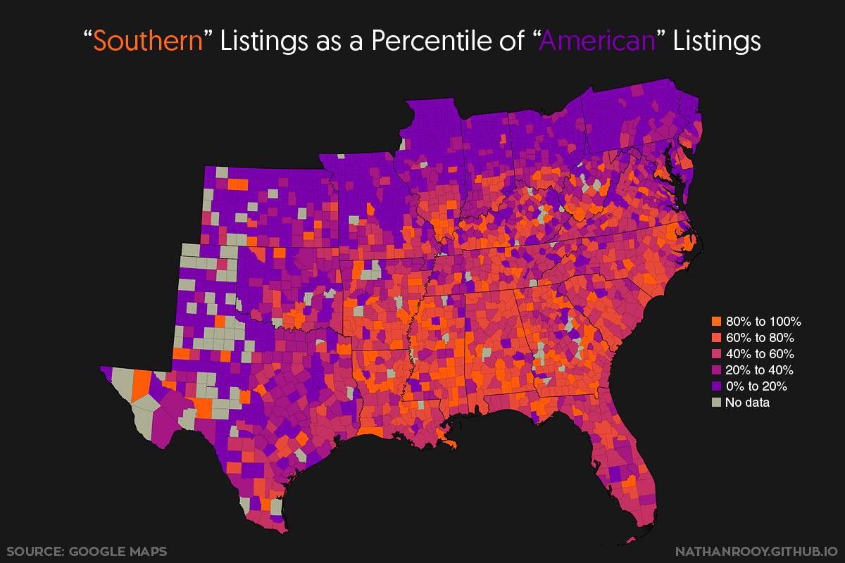
Because the contour levels in the original map were a bit large and uneven, I went ahead and created a second version using five equally spaced levels.
Notes:
Using a Python script I wrote, I was able to scrape all the locations off Google Maps that included the words “American” or “Southern”. This resulted in 33,618 “American” locations and 18,784 “Southern” locations. From here I was able to import the latitude/longitude coordinates into QGIS and calculate the “American”/”Southern” ratio for each county. The exact ratio was calculated using the following: “Southerness“ = Southern / (Southern + American). This means the ratio for a county with 100% “Southern” and 0% “American” references will produce a value of one. A county with 0% “Southern” and 100% “American” references will result in a value of zero.
Original Map:
“Southern Listings As A Percentage of “American” Listings In Telephone Directories, CA. 1975 J.S. Reed, “The Heart of Dixie: An Essay in Folk Geography”, Social Forces 54 (June 1976)