Mapping the Age of Cincinnati
I’ve always been really impressed by those “age of…” maps that I see from time to time on the internet (see here, here, and here) so I thought I would give it a go this winter while I had a little free time. Between web scraping and actual map creation it ended up taking a little over a month to finish.
Click (here) to launch a full screen version of the map in a new window.
Color Gradient Design and Housing Analysis
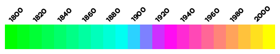
I created the color gradient to highlight the different eras of housing development in the region. Beginning with the earliest 1800’s up until around 1900, depicted here by shades of green and cyan. These areas represent the organically evolved, fine-grained, quality built (brick/stone), and highly walkable traditional neighborhoods. Geographically, these neighborhoods make up the downtown basin area, Mt. Adams, Clifton, Northside, Walnut Hills, Mt. Auburn, and the central business district areas of O’Bryonville and Hyde Park. These tend to be the architecturally rich, sought after historic areas and early streetcar suburbs. Although the streetcars of yesteryear no longer run, using a combination of the bus, Uber/Lyft, and biking, car ownership becomes completely unnecessary. These neighborhoods are prized for their high levels of social capital and community engagement.1
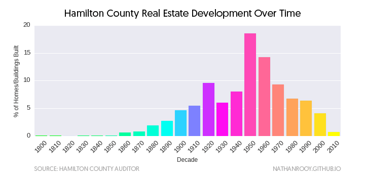
Progressing forward in time we enter the shades of blue, pink and magenta. This represents the massive (see chart above) suburban expansion of post-World War II America which was facilitated by massive government subsidies for whites, redlining, and the automobile.2 This is where building quality, material choice, and architectural originality began to decline and the term “cookie-cutter” home was created. Because many of these neighborhoods were built around the automobile, car dependence starts to become an issue in these areas.3 Much of the traffic congestion and subsequent pollution in the Cincinnati region is attributable to this group of residents. This also means that these same people waste considerably more of their life stuck in traffic than most, even though many are still well within a short bike ride of downtown, work, schools, grocery stores, and local parks. Because of the isolating nature of car dependency and the unwillingness of people to walk or bike for common errands, social capital and community engagement begins to decrease in these areas.4 Examples of these areas include Oakley, parts of Hyde Park and O’Bryonville, Mount Lookout, Pleasant Ridge, Mariemont, Montgomery, Blue Ash, Kenwood, Delhi, Mount Airy, and much of the West Side.
And finally, we come to around the 1980’s to the present depicted by orange through yellow. This represents the mindless, sprawling development that suburbia is known for. Almost everything within this regime is completely car dependent, which means even basic activities such as walking to school, the park, or grocery store are out of the question. These areas are most known for their pretentiously bad architecture and cheap material choice (vinyl siding, brick/stone facade) which usually comes together in the form of a McMansion. Strip malls, generic big box stores, and massive oceans of black asphalt parking are also a common feature in these areas.5 Because the existence of these neighborhoods are predicated on the availability of artificially cheap oil, these neighborhoods are especially susceptible to shocks in oil prices.6 This bears out in suburbias cyclic boom and bust development patterns and housing values. This unfortunate dependency coupled with the fact that real estate development within this current era tends to focus on short term profit rather than longevity, quality, and community improvement precipitates many damaging consequences. The most visible among these is the low density, hop-scotch style development wherin the newer temporarly en vogue subdivisions are built further and further out from the current subdivisions.5 Examples of these neighborhoods include areas such as, Colerain, most of Indian Hill, Mount Washington, Mason, and West Chester which effectivly function as distant commuter exurbs of Cincinnati. These areas are almost completely devoid of originality and what little social capital is left has withered to levels that border on non existent. The end result of this short sided peacemeal developement cycle is that picturesque farm land and natural areas are converted into shopping malls, gas stations, and chain food restaurants at an accelerated rate while simutaneously furthering our dependency on oil, increasing pollution, traffic, obesity, and expensive road projects.7 The sad irony of course being that people who live in the nice, walkable neighborhoods (green and cyan) are forced to subsidize these expensive anti-free market road projects through sales and income taxes even though they will never want or need to use them.8
Methodology
In order to get the necessary data to complete this map, I needed to scrape the real estate portion of the Hamilton County Auditor’s website. The upside to this was that I only needed a trivial Python script that took about 30min to code. The downside was that this was by far the biggest scrape to date and took over a month to complete. After all the html was parsed and the dates had been extracted, I was left with +350k rows of parcel-id’s and corresponding build dates.
Using the shapefiles available on the Cincinnati Area Geographic Information System (CAGIS) I was able to link the buildings to the scraped parcel-id value. This allowed me to assign the year to roughly 95% of the buildings/homes/structures. Unfortunately, this left out roughly 5% without any age. At only 5% this doesn’t sound like much but it represented almost 15k objects. From here I geocoded the addresses and peppered in some geospatial wizardry and gained another 5% or so.
At this point, I was out of intelligent solutions and this being winter, I ended up manually looking up 2553 buildings. Since suburbia is nothing but a wasteland of mediocrity, I focused all of my manual lookup time on the downtown/basin area and closely surrounding neighborhoods.
Overall there are 359,927 buildings/homes/structures, 5438 (1.51%) which are still missing (represented by dark grey).
Known Inaccuracies
There exist several inaccuracies with the map I made. The first is that on many older homes/buildings I ended up assigning the same build date to the garage. This is obviously not correct since many of these buildings predate the invention of the automobile and thus the garage was a later addition. To correct this, I usually deleted the garage entirely if it was a pre-World War II building, and kept the garage if it was a post-World War II building. But this was all done manually so sometimes I went with whatever looked best, thus the inaccuracy.
The second inaccuracy was noticed during the manual lookup phase of this project. There are several structures purported to have been built in 1900 but clearly were not. My guess for this is that 1900 ended up being some kind of default filler value for the people working at the Hamilton County records office for structures that had an unknown build date.
Lastly, several of the buildings on the U.C. campus were merged into a single shape (DAAP + Old Chem, Baldwin + Rhodes, and most of the medical campus among others…) and so instead of spending hours breaking all these files apart, I just averaged the years which ended up working alright.
Jane Jacobs, The Death and Life of Great American Cities (Random House, 2002) ↩︎
Kenneth T. Jackson, Crabgrass Frontier: The Suburbanization of the United States (Oxford University Press, 1987) ↩︎
Catherine Lutz and Anne Lutz Fernandez, Carjacked: The Culture of the Automobile and Its Effect on Our Lives (St. Martin’s Press, 2010) ↩︎
Robert D. Putnam, Bowling Alone: The Collapse and Revival of American Community (Simon & Schister, 2001) ↩︎
James Howard Kunstler, The Geography of Nowhere: The Rise and Decline of America’s Man-Made Landscape (Free Press, 1994) ↩︎ ↩︎
Andres Duany, Elizabeth Plater-Zyberk, and Jeff Speck, Suburban Nation: The Rise of Sprawl and the Decline of the American Dream (North Point Press, 2010) ↩︎
Howard Frumkin, Lawrence Frank, and Richard J. Jackson, Urban Sprawl and Public Health: Designing, Planning, and Building for Healthy Communities (Island Press, 2004) ↩︎
Pamela Blais, Perverse Cities: Hidden Subsidies, Wonky Policy, and Urban Sprawl (UBC Press, 2011) ↩︎