Mapping the Chili Regions of Cincinnati [two year update]
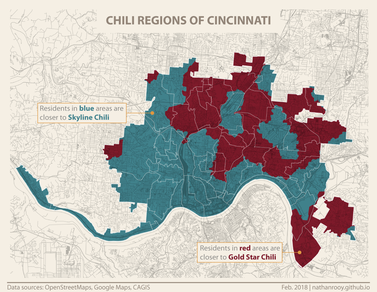
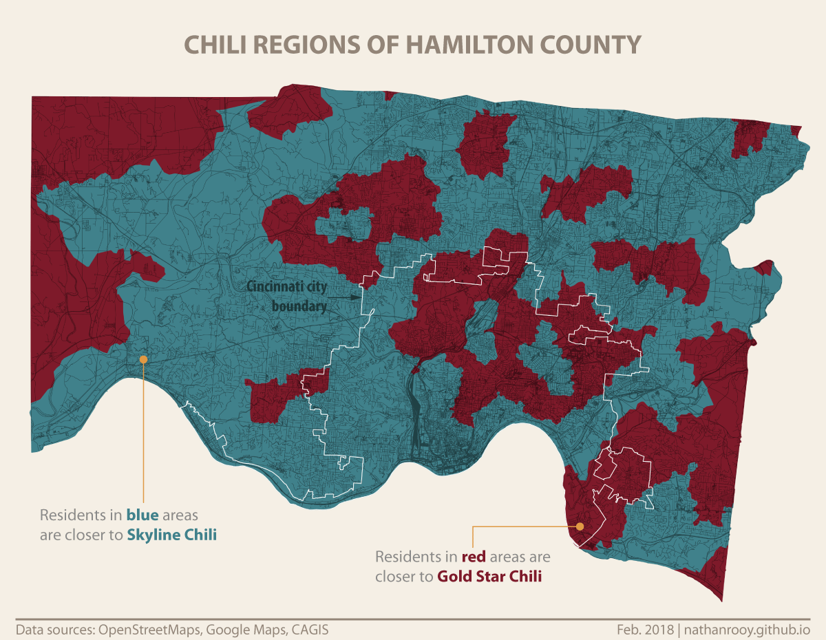
Roughly two yeas ago I wrote my first post on here, in which I created a voronoi diagram depicting the chili regions of Cincinnati. Each region corresponded to being closer to either Skyline Chili or Gold Star Chili. Since a voronoi tessellation is based off Euclidean distance (“as the crow flies”), its usefulness diminishes considerably when applied to street networks. Because we’re not yet traveling around using jetpacks, I modified the distance function to use something called network distance which is calculated using Dijkstra’s algorithm. As the name implies, it’s the length as traveled through a network, in this case, the roads and sidewalks from the OpenStreetMaps database. All calculations were completed using a Python script I wrote. Additionally, since its been two years and some locations have come and gone, I scraped the locations of Skyline and Gold Star from Google Maps and updated accordingly. Once all the data was ready, it was combined with geometry downloaded from the Cincinnati Area GIS (CAGIS) web site, assembled in QGIS, and finished off in Adobe Illustrator.


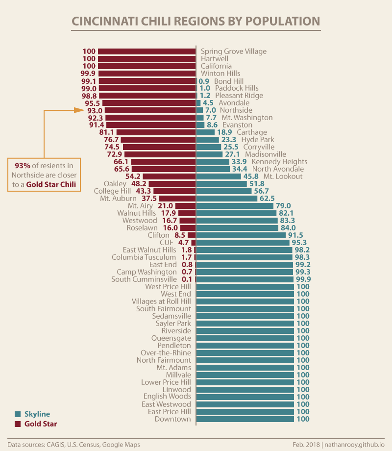
The one real addition to this two year update is the chart below. Using the U.S. census blocks from 2010, CAGIS neighborhood boundaries, and the chili region contours, I calculated the number people in each chili region as a percent of total population in that neighborhood.

Thanks for reading!